
Question: The pie-chart below shows the percentage of a family’s household income distributed into different categories. Describe the pie-chart in 150 words: –
The Percentage of a Family Expenditure
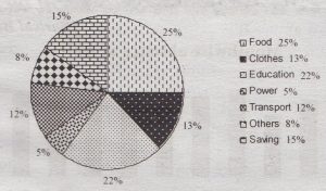
Answer: The pie chart shows the percentage of a family’s household income distributed into some categories. These are food, clothes, education, power, transport, saving and others. According to the chart, the family’s highest expenditure is on food, and it is 25% of the total income. The lowest expenditure is on power which is 5%. However, the family spends 22% of its income for education, 13% for clothes. 12% for transport. Besides the above, the family spends 8% of its income in some other purposes which have been shown as ‘others’. After spending money in all these categories, the family saves some money, and this is 15% of the total income. From the graph, it is clear that the family’s total expenditure is 85% of its income, and the savings is 15%. If we make a list of the categories of expenditure from the highest to the lowest we find this serial: Food, education, clothes, transport, others, and power.