Question: Look at the chart below. It is about the choice of profession by differently educated people. Now describe the chart in your own words.

Chart of The Choice of Profession by Different Educated People
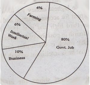
Answer: The chart shows the choice of profession by differently educated people. Educated people prefer govt. Job, farming, business, and intellectual work. A lion share of educated people like govt. Job the participant in govt. Job is 80%. It for our numbers the other professions. Then only 10% of educated people like to run a business. It is 70% less than govt. Job. Less educated people prefer intellectual work. The percentage digit is only single which is 6%. On the other hand, only 4% of educated people like farming. So, govt. the job gets the highest professional value whenever farming gets the lowest. However, the difference between the highest and the lowest preference is 76%.
Similar Posts:
- Describing the Graph of the Choice of Profession by Different Educated People
- Describing the Pie Chart of The Percentage of Types of Transportation Used By Students
- Describing the Graph of The Total Candidates in S.S.C Examination
- Describing the Pie Chart of The Pastimes of The Students
- Describing the Pie Chart of The Benefits of Girls Education
- Describing the Pie Chart of The Passing Rates of Different Subjects of a School
- Describing the Pie Chart of The Percentage of a Family Expenditure
- Describing the Pie Chart of The Sources of Air Pollution in A City
- Describe and Analyze the Chart of The Percentage of Different Age Groups of People Watching Satellite TV In the Three Villages
- Describing the Pie Chart of of The Interest of The Students in Different Subjects