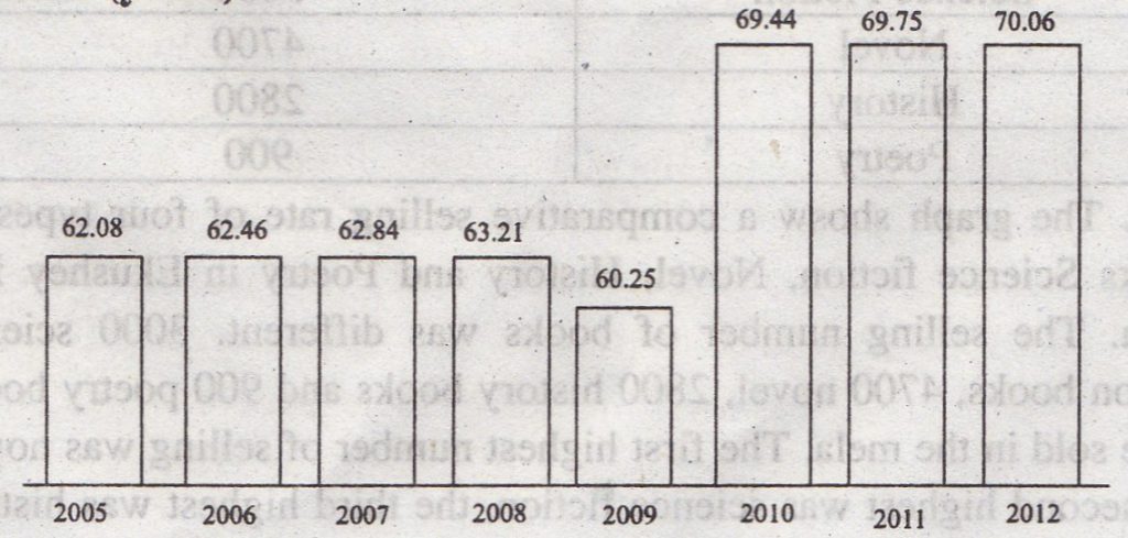
Question: The graph below shows the life expectancy of birth from 2005 to 2012. Describe the graph in 150 words. You should highlight and summarize the information given in the graph. The life expectancy of birth. (years)

Answer: The graph shows life expectancy birth from 2005 to 2012. In 2005 life expectancy was 62.08 years. In 2006 it increased a little. It stood up. to 62.46. It became 62.84 years in 2007. With the continuation of the previous three years, life expectancy became 63.21 years in 2008. The great fall is noticed in 2009. In the year it came to only 60.25 years. It was 2.96 years less than that the previous year. This is the only ball in life expectancy throughout eight years. However, it increased at a great speed in 2010. It rose up to 69.44 which were 9.19 years more than that of the previous year. In 2011 and 2012 life expectancy increased at the rate of 0.38 years to 2006 to 2007. It increased at a rate of 0.31 years in 2010-2012.

