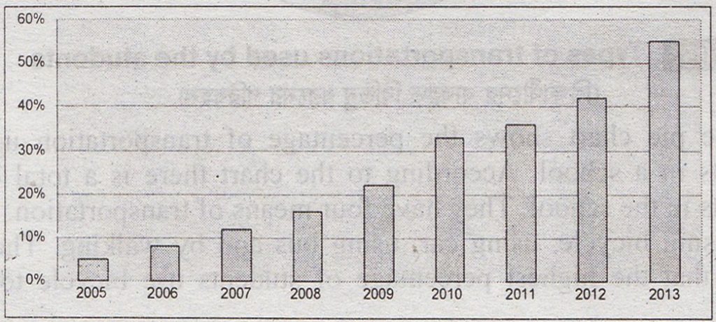
Question: The graph below shows the Internet Users from 2005 to 2013. Describe the graph in 150 words. You should highlight and summaries the information given in the graph.

The Internet Users from 2005 to 2013
Answer: The graph shows the percentage of people using the internet from the year 2005 to 2013. The graph, at a glance, shows a tremendous rise of internet users over the years. In 2005, only 5% of people used the Internet. The next year, that is in 2006, this rises to 8%, which means that in one year’s time 3% more people began to use the Internet. This trend of growth accelerates in next years. We find that in 2007, 11% of people used the internet. The next year, that is, in 2008, it becomes 16%, so the increase in one year is 5%. Again, if we study the graph we find that the percentage of people using the internet increases faster between 2009 and 2010. In 2009 the percentage was only 21 while it rises to 32 in 2010, which means that in one year’s time 11% more people began to use the Internet. However, there is a little increase, between 2010 and 2011. In 2010 it was 32% and in 2011, it rises to 35%, that is a growth of only 3%. But from 2011, again the trend of growth goes faster. Thus, we find that between 2011 and 2012, there is an increase of 7% (41%-34%) users. In 2013 the percentage rises to 54 from 41, that is 13% increase occurs between 2012 and 2013. To sum up, we can say that within a span of eight years the users of Internet rises from 5% to 55% which means a very significant growth of the users of the internet over time.

